Wickes
Freshening up a leading paint brand
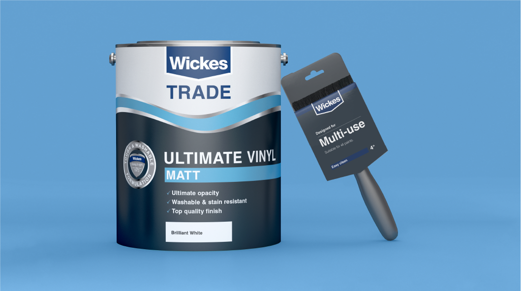
The Wickes Trade Paint range was in need of modernisation and consolidation. We created a more heroic and confident look. Brushes were given a simpler and clearer packaging solution with Wickes logo inspired die-cut shape.
Bold and impactful
A central coloured wave softened the look. Each brush had a clearer naming convention.
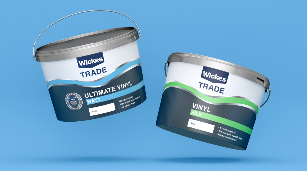
Colour-coded for easier navigation
Foil finishing added a premium feel to the paint tubs.
Creating an iconic packaging solution
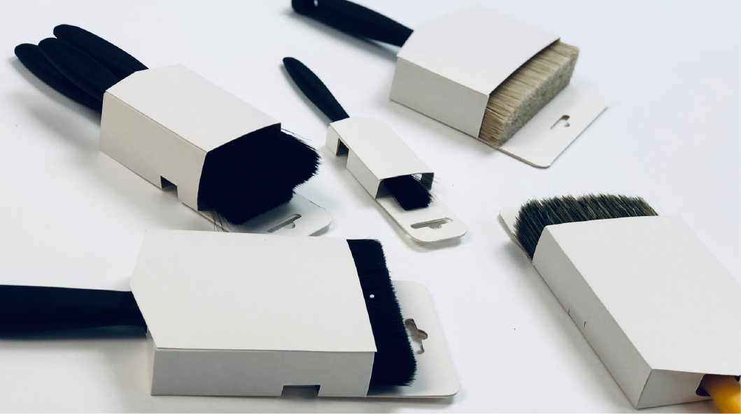
Brushes were housed in an outer wrap with die-cut Wickes chevron detail.
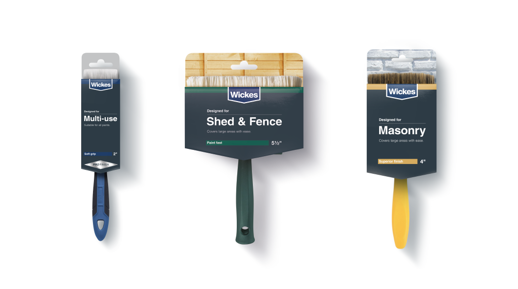
Adding background textures to highlight usage
From sheds to masonry, picking the right brush became an easier task.
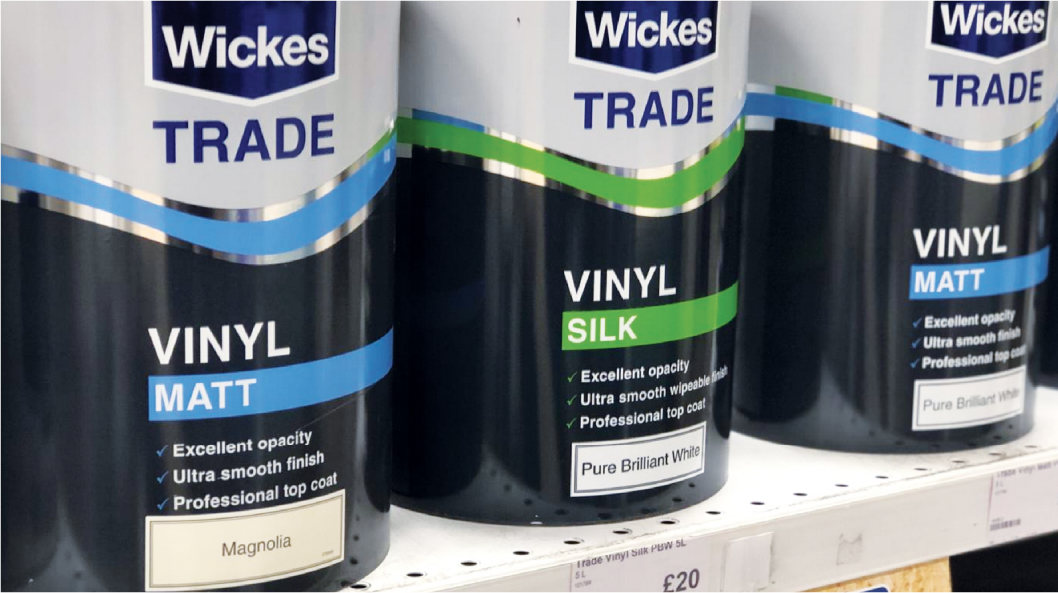
Impact on-shelf
The central coloured wave tessellates when placed against another paint can to create strong brand blocking on-shelf.